lithographs
Lithography was the first fundamentally new printing technology since the invention of relief printing in the fifteenth century. It is a mechanical planographic process in which the printing and non-printing areas of the plate are all at the same level, as opposed to intaglio and relief processes in which the design is cut or etched into the printing block. Lithography is based on the chemical repellence of oil and water.
In traditional Lithography, designs are drawn or painted with greasy ink or crayons on specially prepared limestone. The stone is moistened with water, which the stone accepts in areas not covered by the crayon. An oil-based ink, applied with a roller, adheres only to the drawing and is repelled by the wet parts of the stone. Paper is then pressed against the inked drawing to make a print.
Today, most lithographs are made on modern printing presses, but the fundamental principle is the same. Offset printing presses use the same lithographic repellence of oil and water to apply ink to paper. The term has survived as a way of differentiating Lithographic Offset Prints from Digital Prints, which are made on a digital printer, one at a time.
Because Lithographs are made in quantity, the prices are generally lower. A high degree of consistency throughout the print run is also attained, though prints from further down in the run may have more (very slight) imperfections. This is why low numbers in numbered editions are desirable. Artist’s Proofs are the sheets that came off the press first, when the artist was there to approve the color and balance. They are the “most perfect”, and are sought after for their rarity and quality.
I was starting to build a stock of lithographic prints when computers entered the scene and changed the rules. The lithographs I have on hand were all made to my specifications on acid-free paper with archival inks. I may add more lithographs in the future if the economics of print selling change, but this is the current stock of images.
CERBERUS
Cerberus was my first Lithograph. Done to the size of the original in a process called Duotone, in which two passes are made: once with gray ink and once with black ink. This allows for a very faithful reproduction of the value ranges in the original. For more information on how I “painted” this image in Graphite, see the FAQ. It was a time-consuming process of addition and subtraction with graphite, pencil, and an electric eraser sharpened to a fine point to pick out the tiniest highlights.The detail seen here is just about life-sized; it’s a very detailed drawing. Note that Cerberus is made out of the bodies of the damned. Even his eyes are made of their eyes. He’s pretty horrible.
Zeke was done about the same time as Cerberus, as further exploration of this new graphite technique I was discovering… and to have a sci-punk piece for my first convention in Winnipeg. I wanted to see, too, how this graphite approach would do on larger shapes and broader, smoother passages. I was well-pleased with the results.
She’s a biker bitch with an attitude. And an intriguing tattoo derived from Aztec carvings.
A hot bike.
Kali was my third Lithograph, also a duotone. Painted with the same graphite technique as Cerberus, she was also a time-consuming exercise in minutia. Again, the image to the left is close to actual size, so you can see that it is quite detailed. I had a file folder packed with photos of people, animals, and plants.Many people seem unwilling to look past the nudity to the narrative, which is frustrating to say the least. Costumes tend to put the viewer in mind of a specific time, place, or genre; I wanted to make this timeless and encompassing of many cultures, so I dispensed with clothing. Only Kali herself wears jewelry symbolic of the stages of the moon and a headdress that suggests a crescent moon, as do the horns of Taurus. Look for the stages of life from birth to death, and the three aspects of the Goddess: Maiden, Mother, and Crone.
The Dragonlance was the first lithograph I made from a piece painted for Wizards of the Coast. I was so pleased with the dragon that I made sure it survived into the new Dungeons & Dragons Third Edition style guide, as the Bronze Dragon. I took the opportunity to further think about how the musculature of a dragon ought to look, and I refined some of the thinking I had applied in an earlier painting, Dragonstrike. This time, I made the shoulders of the forelimbs more catlike, and gave the wings a more elegant line. You can see echoes of this in every dragon I’ve done since.
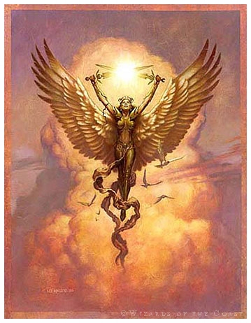
Angel of Light was painted for the Magic: the Gathering beginners set, Portals. The thing I enjoyed most about this painting was the sky, which I did spontaneously and quickly, experimenting with textures as I went. I achieved the wonderful fresco feeling of the sky by laying a thick layer of Acrylic Matte Medium over the whole painting, then blowing on it through a drinking straw. The Medium piled up into ridges and swirls with a lot of character. Then, as I built the color up in layers from yellow to orange in acrylics, and then in blue and gray oils, I buffed back to the last color with a soft cloth, revealing the texture. It’s a technique I still turn to from time to time, because it’s fast and very satisfying.
Silver Dragon was done as the cover of the Silver Anniversary Issue of Dragon Magazine. What could be more appropriate? It was the first opportunity I had to really show off the anatomy of the Third Edition Dragons. The forelimbs are based on the anatomy of a big cat, and I developed musculature for the wings appropriate to the size and mass of a dragon. A silver dragon was something I had wanted to paint since the time I was in art school many years before. Finally! Because he is silver, he reflects the colors of the environment; the blue and gray of the sky all around, and the setting sun behind the viewer
The Wayward Knights was the second book cover I painted for TSR, before taking the staff job and moving to Illinois. This lithograph is non-numbered because Wizards of the Coast used it as a promotion. The artists at Wizards retained the right to make prints, so we felt that it was an infringement for Wizards to be giving them away. The solution was for Wizards to split the print run with us. They gave away an unknown amount of them at GenCon one year, so I can’t in good conscience put numbers on them. Otherwise, they are quality prints, on good paper, at a bargain price. It’s interesting to me to look back on the painting now, to see the clear influence of Jeff Easley in that dragon, but to also see hints of my own vision for D&D peeking through in the armor and attitude of the characters
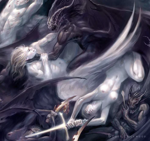
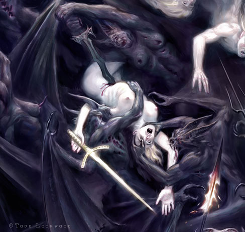
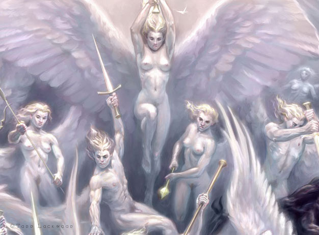
War of Angels was a promotional piece painted for Bullseye Tattoos, as part of a series of posters featuring a number of well-known fantasy and tattoo design artists. The first of my digital paintings to become a lithograph, it is another adventure in minutia, depicting a war between angels and demons. It symbolizes the personal conflicts of morality and spirituality that we all face every day, as well as the ascension of consciousness through the chakras toward enlightenment. It also serves as an interpretation of the Tao in a western visual idiom. The image at the right is about life-size as compared to the print. The signed lithographs are limited to a run of 350.


